Five to Flow Website

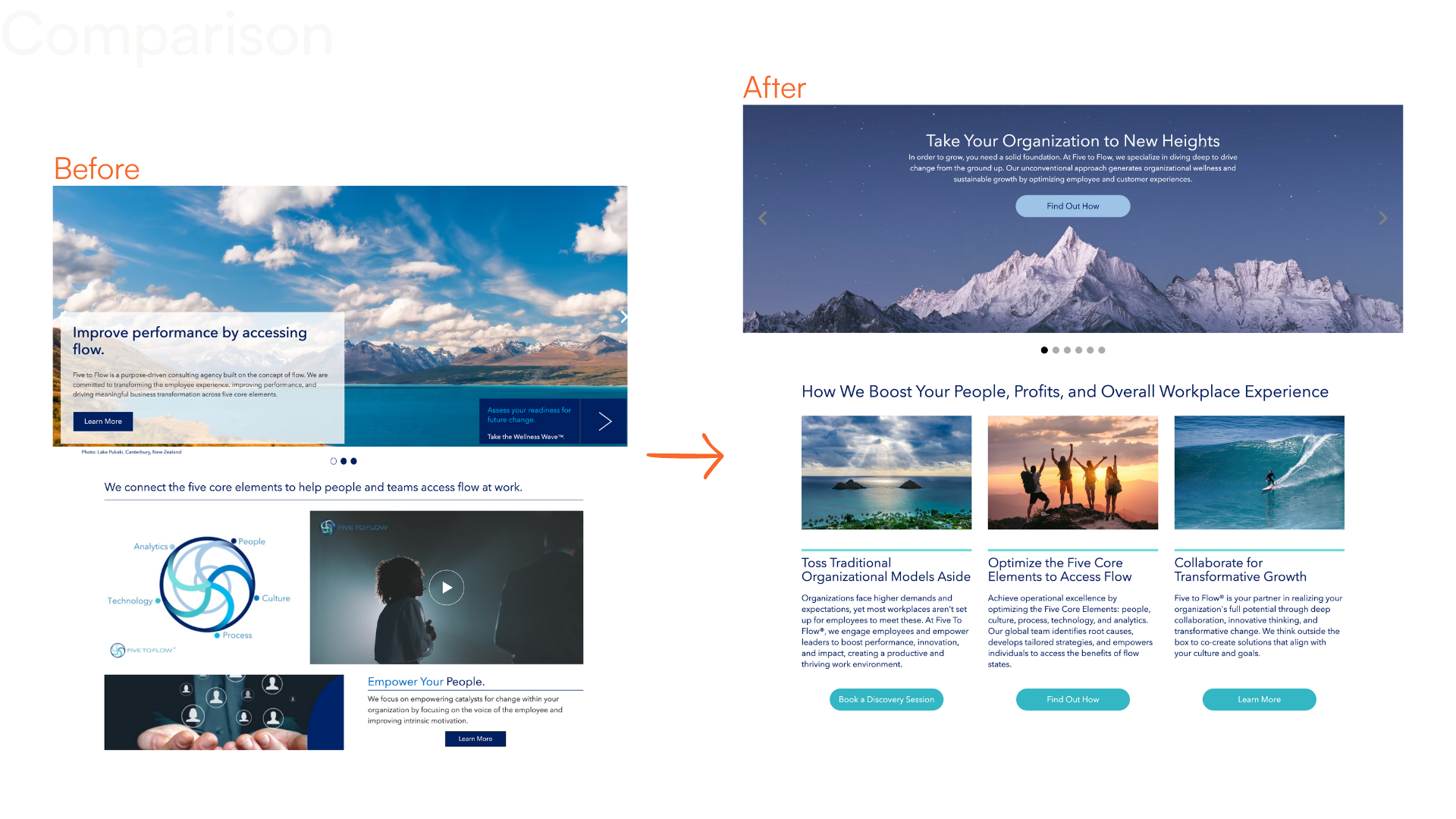
Five to Flow is a consulting company offering OCM support and digital tools. The existing website lacked clear structure and made it difficult for users to understand the offerings or take next steps. I led a redesign for key webpages focused on improving information clarity, user flow, and visual consistency. My work spanned UX strategy, copywriting, visual design, and collaboration through launch.
Project Overview
The goal of this project was to create a clearer and more effective web experience that supported both new and returning users. I focused on restructuring the information architecture, simplifying messaging, and designing a modular layout system that could scale as the brand evolved. The redesign aimed to reduce confusion, highlight core offerings, and guide users toward meaningful engagement.
My Role
  • Led UX strategy and information architecture
  • Wrote and refined website copy to improve clarity and tone
  • Designed page layouts, components, and visual hierarchy
  • Collaborated with stakeholders to align design with business goals
  • Supported launch and reviewed performance metrics post release
Key Results
  • +777% increase in site views
  • +125% longer average session duration
  • +62% increase in new visitors
  • Positive feedback from both internal teams and users on clarity and tone
Before and after of the homepage
Process
I audited the existing site to identify where users were getting confused or dropping off, then mapped a clearer content structure. I simplified long blocks of copy, introduced people focused visuals, and reorganized calls to action to guide users more intentionally. I designed a modular layout to make pages easier to scan and navigate. To implement the redesign within TimeSites, a restrictive CMS, I learned the platform from scratch and adapted the design to work within its constraints.
  • Unclear Messaging & Layout: Restructured the information architecture and rewrote site copy to improve flow, clarity, and comprehension.
  • Tool Constraints: Learned TimeSites independently and worked with technical support to implement custom layout solutions within platform limits.
  • Visual Alignment: Replaced abstract icons with human centered imagery to better reflect the brand and connect with users.
Challenges and Solutions
Analytics

Dates

Duration

Visitors

Views

Before

12/2023 - 07/2024

7:23 mins

12,144

56,615

After

07/2024 - 04/2025

16:38

22,812

496,428

Discovery session redesignContinued redesign images
Reflection
This project pushed me to think holistically about language, layout, branding, and the tools available to me. I worked across disciplines to bring clarity to a complex brand story and learned to adapt quickly on an unfamiliar platform. Seeing measurable improvements after launch reinforced the value of iteration and thoughtful structure. It reminded me that good design helps ideas move clearly and efficiently from intention to action.