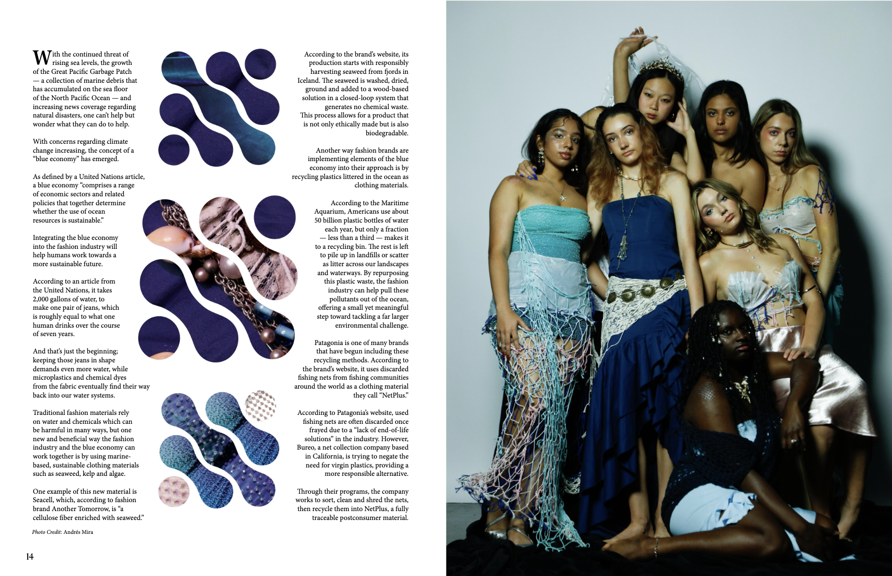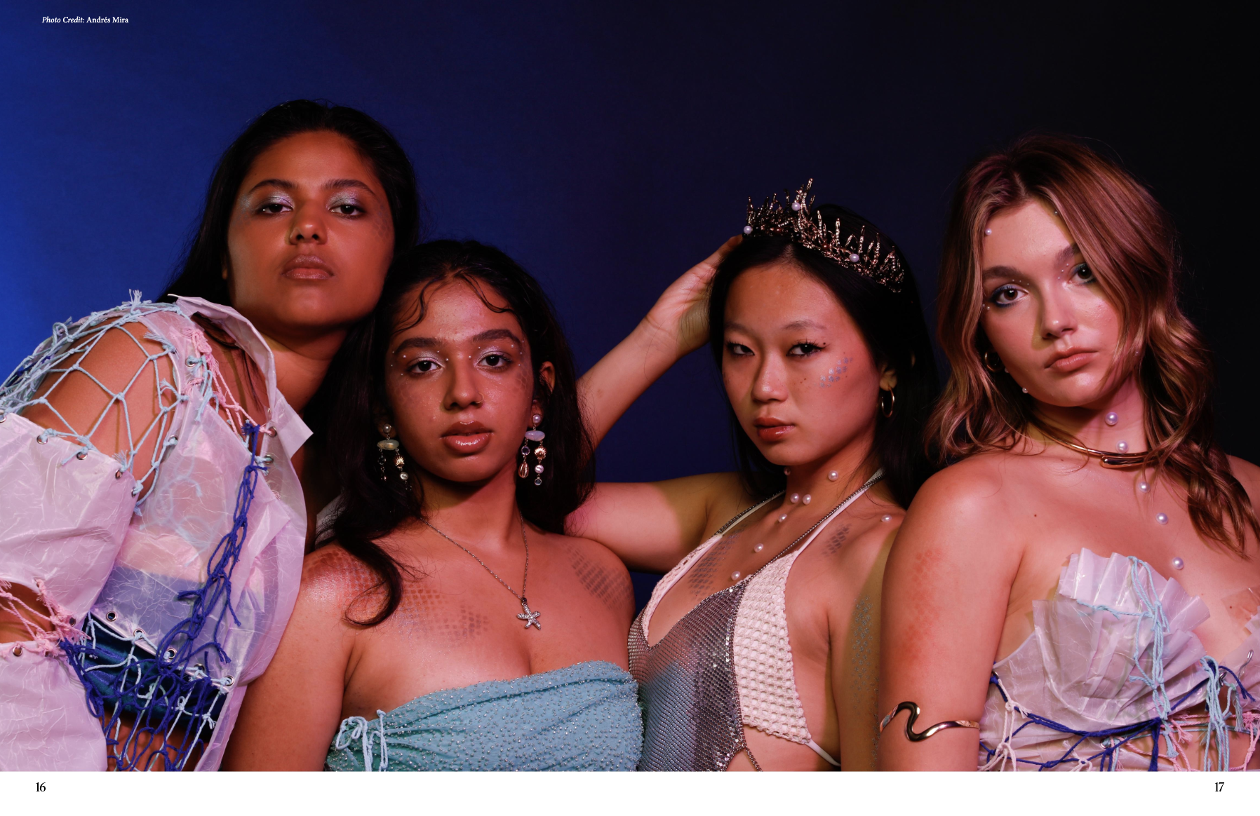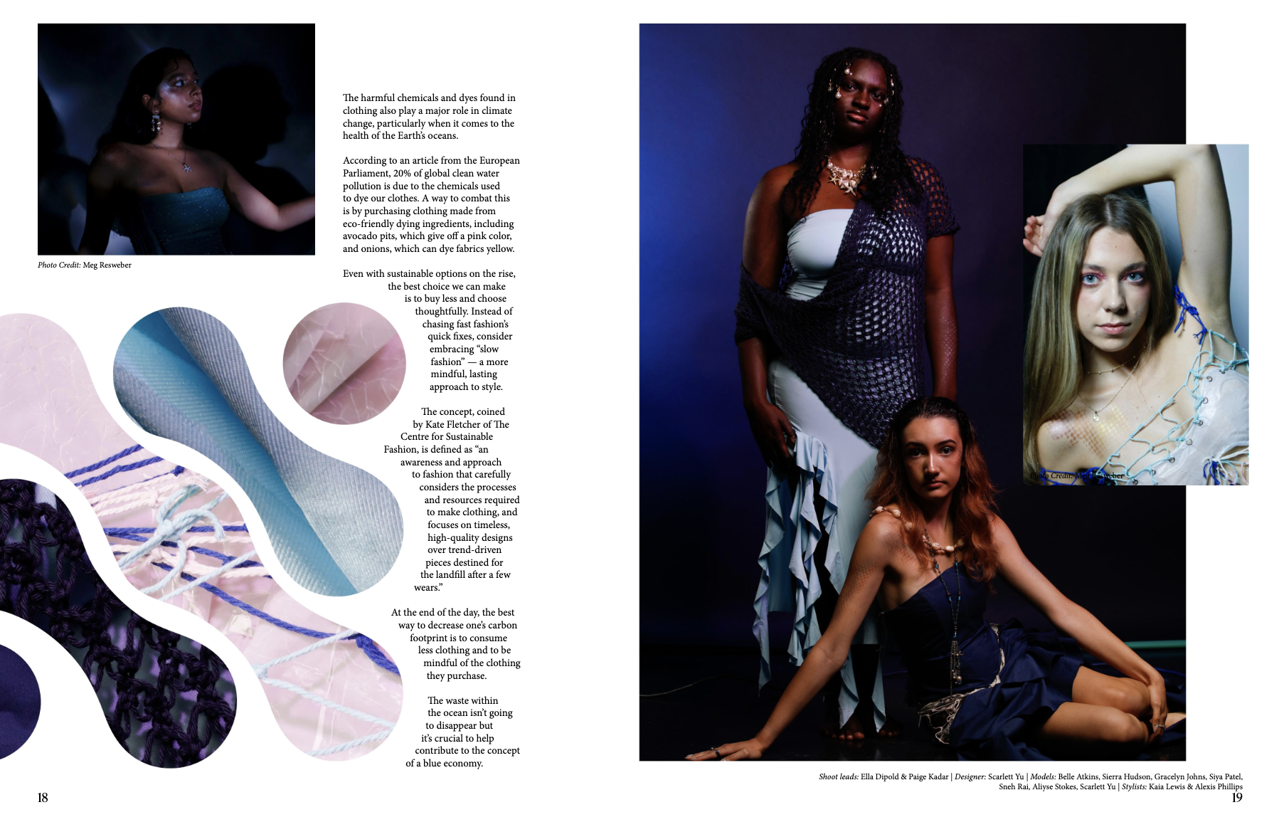
We started with a photo set and loose concept provided by Scarlette’s editorial leads. I created a mood board on Pinterest and pulled references for fluid shapes, ocean tones, and layered text treatments. Since my design partner didn’t have Adobe access, we built our first drafts in Canva to keep things collaborative.Once we aligned on flow, I rebuilt the final spreads in InDesign, integrated typographic systems, and adjusted layout based on editor feedback. The result was an editorial piece that felt immersive, clean, and cohesive.
- Theme translation: Designing for a water-inspired theme without overwhelming the article was a balancing act. I used organic shapes and white space to maintain readability.
- Tool constraints: To support my collaborator, I led sessions in Canva and refined output later in InDesign.
- Creative leadership: I coordinated regular check-ins, managed image selection from over 70 raw shots, and guided final typography and pacing choices.
.png)


Reflection
This project strengthened my visual judgment and my ability to design within editorial constraints. Working with a changing group of contributors required clear systems and thoughtful decisions to maintain consistency without limiting creativity. It reinforced the importance of hierarchy, pacing, and restraint when designing for content heavy experiences.

.png)


